Magazine Spread Project

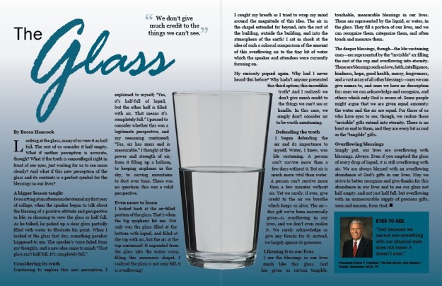
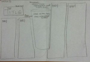
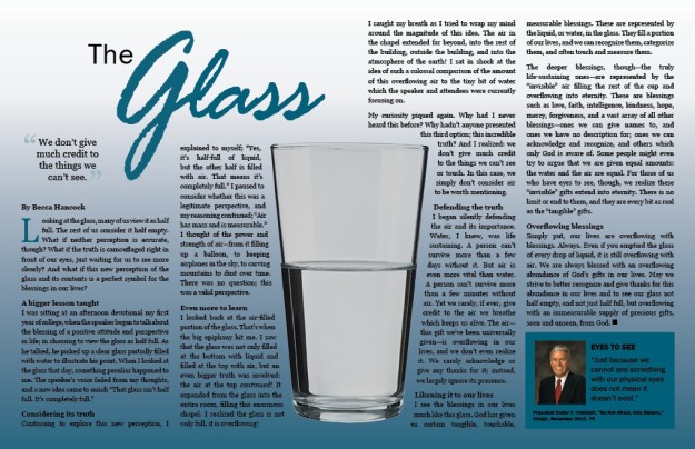
This project began several weeks ago when I wrote the article and is a continuation of my last post several days ago when I submitted a draft for final critique. Already having a written article to use made a huge difference in being able to focus entirely on the design aspect of the project this week . I already had a couple of layout ideas sketched out, and I chose the one which I felt would strengthen the message of the article the most by having one large image in the center of the page. My audience is for readers of the Mormon magazine, The Ensign, which is targeted toward young adult and adult readers. My message is a new perspective about the blessings in our lives and the way in which we often don’t give credit or acknowledgement to many of those blessings. I created the shape map in InDesign, and made some changes from my ideas with the sketch, thinking a more neutral color scheme with a colored title would make the central idea stand out more.

7A.MagazineSpread.Sketch.Hancock.UsedBeccaHancock.ShapeMap


BeccaHancock.12A.Final

Critique:
Three of my classmates (Shay Sookhoo, Samantha Anderson, and Chris Betts) commented that my very first draft needed more color in it (instead of just the gray and title color). I took their advice and added the colored gradient background and colored text box to match the title color. My class instructor, Julie Peterson, gave several valuable suggestions as well. She pointed out that the title in my first draft was creating trapped white space. To fix this, I followed her advice to move the title to the right and make the ‘G’ smaller. I also decreased the tracking in the word “Glass” to make it fit better in the space. She also caught a widow in one of my paragraphs. Adjusting the tracking in the paragraph didn’t fix the problem, so I changed some of the words in the paragraph to ensure the widow was gone. I also moved the quote on the left page over to the far left side since it fit better and felt more grounded being lined up with my name as the author below it.

When I finished these edits, I sent the JPG file to a print shop with specifications of how I wanted it printed. Unfortunately, it was really poor quality–the whole page was pixelated and not crisp or sharp at all. The shop suggested that I send a PDF to them instead of the JPG file, which I did. I asked them to call and let me know if the second print was better quality, which they did. When I picked it up from the shop, I trimmed the white edging off, and the final print is what you see in the video below.

Fonts:
Title: Franklin Gothic Book (Sans Serif) & Rage Italic (Decorative)
Body: Georgia (Serif)
Colored Quote Box: Franklin Gothic Book, Franklin Gothic Demi (Sans Serif)

Image Sources:
Glass: http://www.handicappeddoctor.com/?p=849
President Uchtdorf: http://www.mormonnewsroom.org/leader-biographies/president-dieter-f-uchtdorf


Magazine Spread Draft Critique

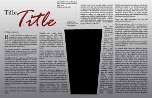
This week has been a really exciting one because I was able to start working on creating my magazine spread which started several weeks ago. After creating a few shape maps and finding images online to use, I decided on a specific layout and was really excited to see what it would look like with all the pieces together. Knowing that I was writing a piece which could be used in the Ensign, I wanted a simple, meaningful layout for the audience of adult and young adult readers, with one main image which would strengthen the message of the story I was sharing. With this in mind, I adjusted my shape map to have a more neutral color tone with a stronger pop of color only on the title. To set up my page in InDesign, I used a Tabloid-size page and added 0.5 inch margins inside the page as guidelines. My next step was to place the actual image.  I had previously “cut” the glass out of the photo in Photoshop, applied a transparent background around it, and then adjusted the shading of the photo to make it look better on the InDesign page.  After placing the image in InDesign, I added a gradient background to the entire page and created an invisible shape following the shape of the cup which I applied a text wrap to so the body copy would wrap around the glass. I inserted my text for the story and title, applied specific fonts, and adjusted the height of the text columns and the leading to make the body copy look more evenly spaced. I also received some classmate feedback which I applied (part of which indicated that the page needed more color), so I reverted back to my original plan of having a monochromatic blue color scheme. This is what the magazine spread looks like before the final critique:

BeccaHancock.12A.2

Here are the sketch and shape map used for this project:

12A.MagazineSpread.Sketch.Hancock

BeccaHancock.ShapeMap

Fonts:
Title: Franklin Gothic Book (Sans Serif) & Rage Italic (Decorative)
Body: Georgia (Serif)
Colored Quote Box: Franklin Gothic Book, Franklin Gothic Demi (Sans Serif)

Image Sources:
Glass: http://www.handicappeddoctor.com/?p=849
President Uchtdorf: http://www.mormonnewsroom.org/leader-biographies/president-dieter-f-uchtdorf


Web Page Layout Project

WebPage.FINAL

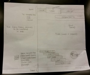
11A-ShapeMap-BeccaHancock

11A-Sketch-BeccaHancock

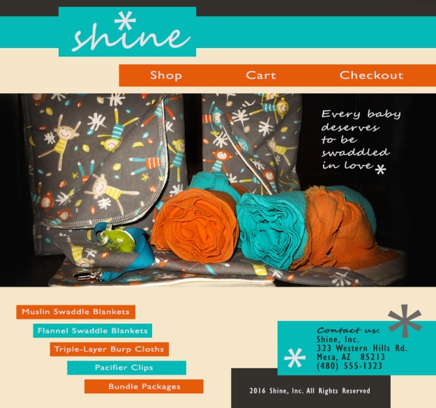
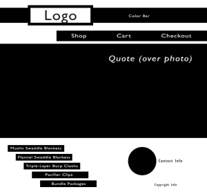
Process: Once I decided on a business to create a website for, I began by drawing several sketches of layout ideas. I considered my audience, which would be mainly mothers and women looking for baby gifts, and then narrowed it down to the sketch I thought would showcase the product the best, which was one picture of all the products together with navigational links for each separate product for my audience to browse through. I wanted my message to be one of warmth and light, which is why I chose the company name ‘Shine’. Once this process was complete, I created a shape map in Photoshop with layers for each individual part. I then pulled in my edited image and began to establish my color scheme. I utilized the eyedropper tool to capture colors which would match the main areas of the photo, and worked forward from there. I chose two contrasting fonts, and used two styles from each of the fonts. I also used a symbol from a font as the design element. Once all the pieces were in place, I combined all the layers and saved the final website page view as a JPEG.

Critique: When I was finished with my shape map, I emailed it to my instructor for some feedback. She suggested I create a little more asymmetry with the bottom right half of my page since the circle and copyright information didn’t really line up with anything. My husband also commented that the circle looked out of place, so I replaced it with a rectangle in the final page, and I created another visual diagonal line with the elements in the area  my instructor pointed out. When my page was completed, I shared it with our class Facebook group. Nicole Stock mentioned that the dark background of the picture seemed out of place with the lighter background and the bright colors in the rest of the website.  I added some darker elements to the page to tie in the dark background in the photo.

Image source: Photo of blankets and baby items: taken by myself

Font names & categories: Segoe Script Regular & Segoe Script Bold/Decorative; Gill Sans MT Regular & Gill Sans MT Condensed Regular/Sans Serif; (design element was the * symbol from Century Gothic Regular/Sans Serif)

Color scheme: Complimentary; blue and orange

Movie Poster Project


10ABHancock.BlogCopy

Message/Audience: For this project, we were assigned to create a movie poster to introduce ourselves to co-workers at a new job. Since I love being adventurous and a bit daring, and I balance the fear involved with those circumstances with being somewhat goofy, I wanted to create an adventure-turned-thriller type of movie with a twist of ridiculous humor. I love venturing into the unknown, and although it can sometimes mean heading for disaster, I tend to survive the threats with humor, a few good skills, and dumb luck.

Process: I used Photoshop for this project, and utilized a movie poster for Malibu Shark Attack for the large portion of this poster. I isolated the bottom shark teeth, top shark teeth, and water/face as 3 separate images. I then moved the bottom teeth up so I could create a black area below for my body text in the Movie Font to be more visible. I added my own photo of sky above the water and behind the top shark teeth after manually adjusting it to better match the color and tone of the water. I also manually adjusted a picture of my face to cover the actor’s face in the picture, created a mask to only show the portion of my face that I wanted, and adjusted the lighting and shading to make the faces blend into each other. Last of all, I added the text in individual textboxes for each area and adjusted their colors as needed.

Critique Report: I posted my project on our class Facebook page for feedback and sent a copy to my class instructor. I received a recommendation from a classmate, Christina Carrick, to address the lighting on my face, and my instructor also mentioned this area of the poster, suggesting that I could lighten the side of my face a bit more where the light source is coming in. I used the dodge tool to accomplish this edit. It took several tries before getting the right balance of lightening the image but keeping some shadows so it still looked realistic. Additionally, my instructor said my text was too close to the left and right edges in the area at the bottom of my poster, so I adjusted that.

Images:
Original image taken by Becca Hancock: sky
Original image  taken by John Jones: Becca’s face
Movie poster: http://iscfc.net/2016/01/14/malibu-shark-attack-2009/

Fonts/Categories:
Name at top =  Goudy Old Style Bold (Serif)
Movie Title & Date = Impact Regular (Sans Serif)
Body Copy = SF Movie Poster Condensed Regular & SF Movie Poster Bold (Sans Serif)


Photographic Study Project

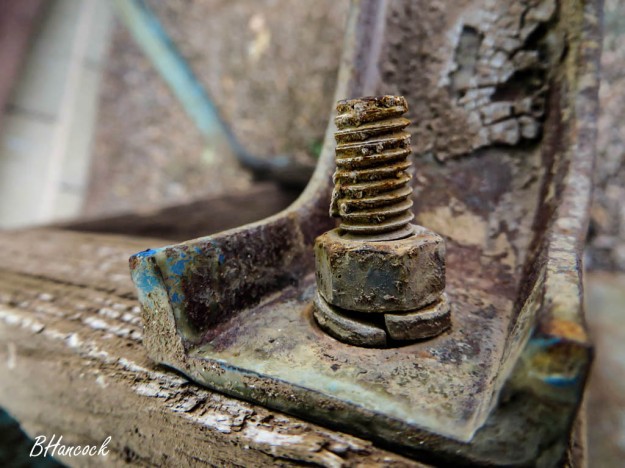
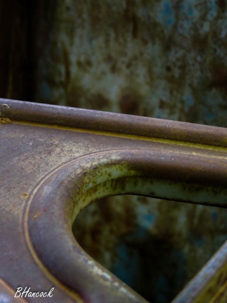
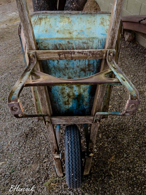
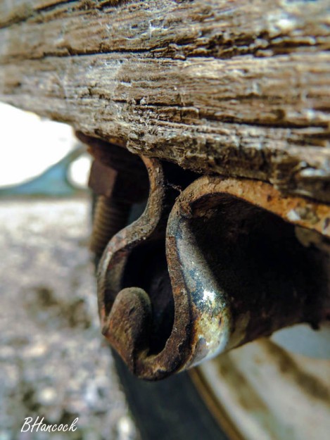
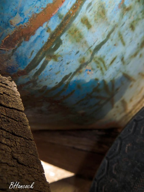
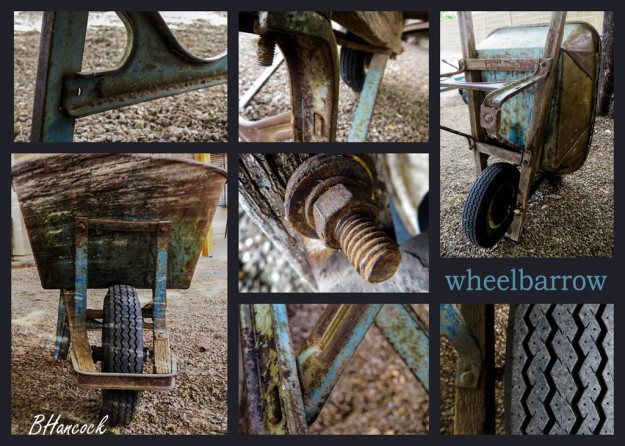
This week’s project was both a challenge and a great amount of fun. Our goal was to discover new perspectives of an everyday object by capturing 12 photographs of our chosen object with different angles, depths, vantage points, and leading lines. I chose a wheelbarrow which has been used by my husband’s family for over 25 years. Its combination of metal and wood and its worn-through colors weren’t something I paid much attention to prior to this project. Now I can’t see it without feeling an incredible attachment to and love for it.

I shot my pictures in the late afternoon light under some trees in our backyard. After choosing my 12 final photographs, I imported them into Photoshop and began the process of editing them. I must say, Photoshop is much less intuitive than Lightroom, and the learning curve is a lot steeper. I was able to blend a wood texture over a front-facing photograph of the wheelbarrow, and also applied a technique for color-matching two of the photographs which had a different lighting tone than the others. I also applied adjustment layers to fix some lighting issues in several photographs. I then created a grid layout in Photoshop to create a collage with some of these images. I selected the images I wanted to use and copied and pasted each photo into the collage file as its own layer. With some hard work and persistence, it turned out to be something I’m very proud of. The rest of the photos from my collection are shown individually below. Click on each image to see it full-sized.

BeccaHancock-Wheelbarrow-5

BeccaHancock-Wheelbarrow-4

BeccaHancock-Wheelbarrow-3

BeccaHancock-Wheelbarrow-2

BeccaHancock-Wheelbarrow-1

BeccaHancock-Wheelbarrow-6

I shared my collage on Facebook with our class group in order to get some feedback prior to submitting my work. Christina Carrick mentioned the blue color used for my text didn’t seem to match the blue in the pictures very closely, so I experimented with the eyedropper tool to get some more turquoise hues like she suggested. In the end, I used a color almost identical to my first choice since it provided a better contrast between the background and font color. Ben Harker suggested that I create more contrast in my blended photograph so it was easier to notice, and suggested using a different font for the collage title; both of these suggestions were implemented.