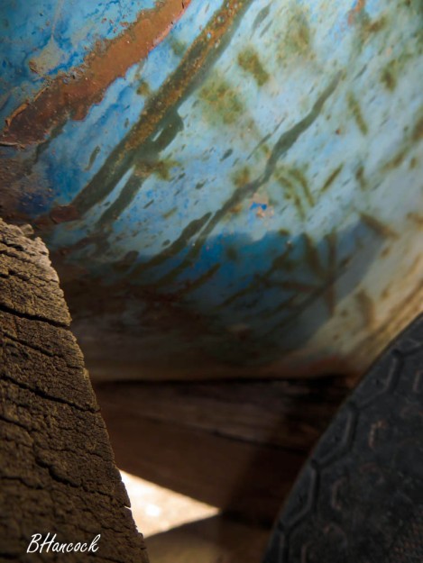
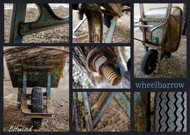
This week’s project was both a challenge and a great amount of fun. Our goal was to discover new perspectives of an everyday object by capturing 12 photographs of our chosen object with different angles, depths, vantage points, and leading lines. I chose a wheelbarrow which has been used by my husband’s family for over 25 years. Its combination of metal and wood and its worn-through colors weren’t something I paid much attention to prior to this project. Now I can’t see it without feeling an incredible attachment to and love for it.
I shot my pictures in the late afternoon light under some trees in our backyard. After choosing my 12 final photographs, I imported them into Photoshop and began the process of editing them. I must say, Photoshop is much less intuitive than Lightroom, and the learning curve is a lot steeper. I was able to blend a wood texture over a front-facing photograph of the wheelbarrow, and also applied a technique for color-matching two of the photographs which had a different lighting tone than the others. I also applied adjustment layers to fix some lighting issues in several photographs. I then created a grid layout in Photoshop to create a collage with some of these images. I selected the images I wanted to use and copied and pasted each photo into the collage file as its own layer. With some hard work and persistence, it turned out to be something I’m very proud of. The rest of the photos from my collection are shown individually below. Click on each image to see it full-sized.
I shared my collage on Facebook with our class group in order to get some feedback prior to submitting my work. Christina Carrick mentioned the blue color used for my text didn’t seem to match the blue in the pictures very closely, so I experimented with the eyedropper tool to get some more turquoise hues like she suggested. In the end, I used a color almost identical to my first choice since it provided a better contrast between the background and font color. Ben Harker suggested that I create more contrast in my blended photograph so it was easier to notice, and suggested using a different font for the collage title; both of these suggestions were implemented.
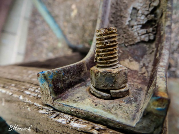
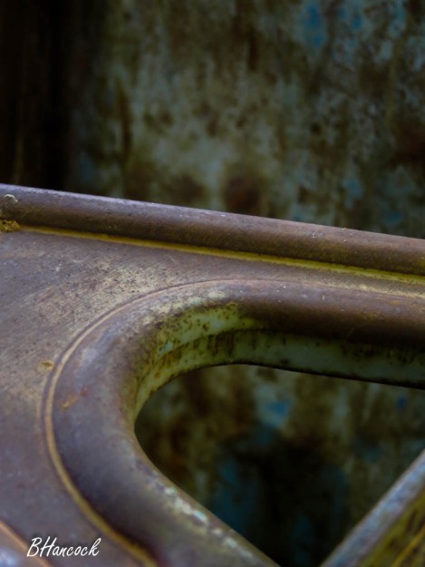
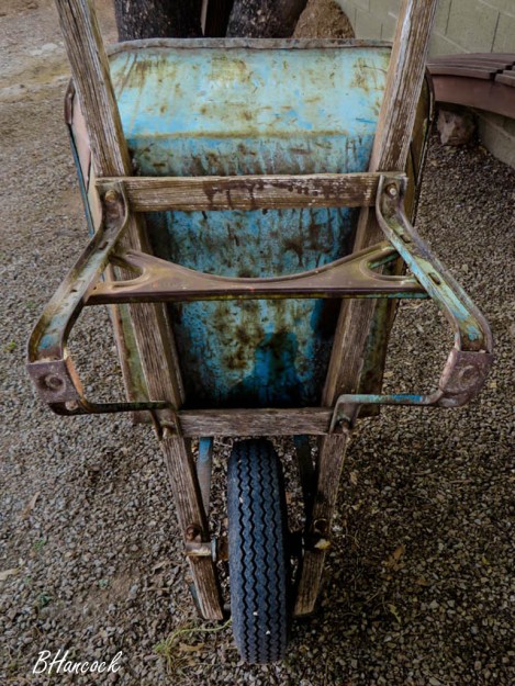
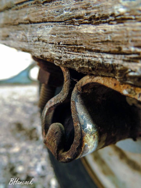
I don’t know if it’s because I worked with metal for many years, but I love rusted metal. I like the images you took very professional. I have an old wheelbarrow as well and almost did mine on that one too. I like the tone that you used on the images.
Here is my project, come check it out let me know what you think:
https://mariojesparza.wordpress.com/2016/03/04/9a-photography-study/
LikeLike
Becca, I really like your pictures! I love the colors and the different angles you shot your pictures from. I love the vintage look and how this simple object made such pretty pictures.
Check out my blog here:https://megnicoledavis.wordpress.com/
& Lexi’s blog here: https://lexihallcommunications.wordpress.com/
LikeLike
I really like this collage! It looks very professional. You did a really good job of getting a variety of different angles and perspectives. I love the different colors that the rust bring out, and I think you did a great job putting it all together as one piece! Check out Samantha’s project here:
https://samanthaandersonblog.wordpress.com/
LikeLike
https://michaelabelbin.wordpress.com
LikeLike
I really loved seeing all the different angles of your project! I thought this project was fun and we were able to gain new perspectives. I liked the color and contrast that was used as well. I have to agree that the vintage look captured a cool look overall and the pop of blue was my favorite. Great job!
LikeLike