Tasteful Typography Project
I designed this project using Microsoft Word. Below is a screenshot while in Word.
Screenshot in Word
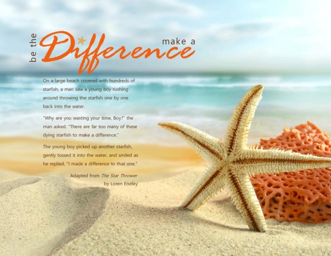
Process: I looked for an image I wanted to use which successfully incorporated the rule of thirds. When I saw the image I chose, it reminded me of a story I loved about starfish, and I decided to incorporate the image with the story. I found several versions of the story online, but they were all too long, so I wrote a condensed version in my own words to use. My message became making a difference and being the one to initiate making a difference. My audience was teens and adults seeking inspirational messages which possess some boldness and energy (not just passive, subtle messages). I wanted the finished product to inspire, so I intentionally chose this image with a bold color to incorporate in the design typography. The image being divided into thirds made it easier to place the title and body text, so I planned my basic layout of title and body copy to be in the areas which were less busy. As I had been writing the body copy, I thought of two possible titles and then considered implementing both of them instead of only choosing one. I chose the font for the largest word of the title and did my best to color-match it to the boldest color of the image, the reddish-orange of the sponge. The smaller, simple font of the two titles and the body text are color-matched to the dark brown color inside the starfish, and provide good contrast and readability. I added a star symbol with a matching rounded outline to help it look more like a starfish for the design element, and I covered the dot in the ‘i’ of the main word in the title with this star. I also tilted the star to repeat the slant of the starfish in the image. I used a color similar to the sand and starfish to bring more repetition and unity from the image to the title. After this was finished, I saved the image as a PDF, and then converted it to a JPG using an online program.
Critique Report: I posted my design on our class Facebook group Tuesday evening. At first I wasn’t getting any critiques, so Wednesday I created a second version of the title which I had originally considered using, and asked for preferences between the two. Five hours later I still hadn’t heard from anyone, so I begged for critiques! Karin Cabalo and Nicole Stock both responded, indicating they liked my original title best, so I kept my first design. Nicole Stock also suggested lightening the color of the design element (star) to match the starfish. I tried this, but there wasn’t enough contrast with the lighter color against the light background, so I kept the original color. I emailed my design to our class instructor, Sister Peterson, and she suggested in her video critique that the smaller type in my title should be consistent—either all caps or all lowercase, since my combination of the two made it feel like it was accidental. I experimented with the two choices and chose the lowercase option because the uppercase letters ‘THE’ didn’t look good at all when they were vertical—they looked boxy and like weird symbols instead of looking like a word or part of a message. Sister Peterson also suggested that I give credit to where the story came from, so I researched and found the author of the original story, and added ‘Adapted from’ to the source and author for my design. Adding this much text as a source was tricky, so I broke it into two lines and aligned them with the right side of my body rag.
Link to image: http://photos.alphacoders.com/photos/view/6822
Links to stories and original source:
https://www.pinterest.com/explore/starfish-story/
http://www.addisfaithfoundation.org/it-made-a-difference-to-that-one/
http://edutechstories.blogspot.com/2015/04/how2-make-sure-every-teacher-matters.html
https://www.google.com/search?q=who+wrote+the+starfish+story&ie=utf-8&oe=utf-8
http://www.jonasmaxwell.com/pages/index.cfm?pg=155&cat=3
Font Name/Category: Title: Rage Italic, decorative & Malgun Gothic, sans serif; Body Copy: Malgun Gothic, sans serif

I love your picture and the story you choose to compliment it. I have loved this story from the first time I heard it and it has made me feel I need to be better at reaching out to others with love and care. I really like how you used your shape as part of your title. It helped connect the picture with the text. I think you did a great job with using both of your titles in one and how it gave your piece a uniqueness not found in any other project. Great job.You should check out Mario’s project https://mariojesparza.wordpress.com/2016/0/28/tasteful-typography-poje1ct/. He also did one about standing out and being true to yourself.
LikeLike
I love, love, love your design! The story of the starfish is one of my absolute favorites! The way your title says “be the difference” and “make a difference” is extremely clever! And I love the design element that you incorporated with the word difference! Feel free to check out my design! https://ukulelegirladventures.wordpress.com/2016/01/29/tasteful-typography-project/
LikeLike
Just one word: GORGEOUS!!
This is so adorable and meaningful in any way! The tittle that you choose and how you decided to project two phrases in just one it’s amazing! As well how you contrast each one of the colors of your title with your image is totally professional and clean! The story behind your work and the body copy that you choose implement everything beautifully, the story it’s very meaningful and for your target it’s perfect! Great great job!
Feel free to check out my design!
https://sidneywonderland.wordpress.com/2016/01/29/tasteful-typography-project/
LikeLike